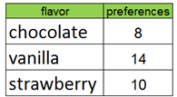
Learning to read Bar Graphs:
Pictographs
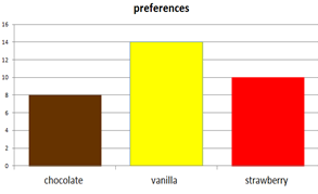
Dot Plot A simple graph that represents a set of data by using dots over a number line. Each X (or dot) is one result.
Summarizing data using dot plots:
Line Graph A graph used to show change and direction of change over a period of time.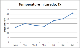
Summarizing Quantitative Data (Scatter Plots)
Measure and Representation of Data – Histogram
A special kind of bar graph that displays the frequency of data that has been organized into equal number groupings. The number groupings cover all possible values of data, therefore there are no spaces between the bars.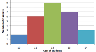
Histograms
Measure and Representation of Data – Circle Graph
A graph used to compare parts of a whole. The circle represents the whole and is separated into parts of the whole.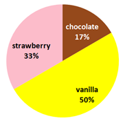
Reading and Interpreting Pie or Circle Graphs:
Select a Graph
Measure and Representation of Data – Venn Diagram
Venn diagrams are diagrams that show all hypothetically possible logical relations between a finite collection of sets. Draw a Venn diagram that shows the following sample space and events:
- All the integers from 1 to 12
- Even numbers
- Multiples of 3
The Venn diagram is as follows: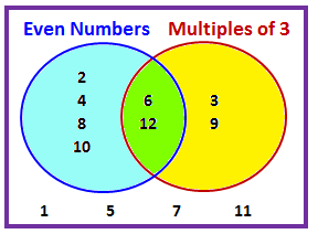
Creating, Reading and Interpreting Venn Diagrams:
Stem-Leaf Plot
A Stem and Leaf Plot is a type of graph that is similar to a histogram but shows individual values.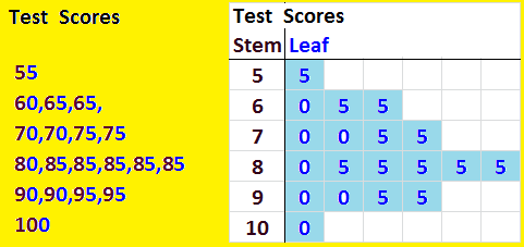
Reading Stem-and- Leaf Plots
Measure and Representation of Data
To get a sense of the data’s distribution we use the five statistical summaries:
the (1) minimum, (2) maximum, (3) median (or second quartile), (4) the first quartile, and (5) the third quartile.
Example, Test scores: 60,70,70,70,85,85,85,90,100
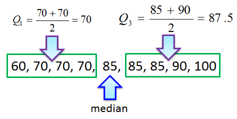
Population size: 9
Median: 85
Minimum: 60
Maximum: 100
First quartile: 70
Third quartile: 87.5
Interquartile Range: 17.5
We can use a steam-and-leaf plot to find and display the median, the Q1 and the Q3
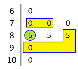
The median is at 85 and is marked by a circle. The Q1 is (70+70)/2=70 while the Q3 is (85+90)/2=87.5

PR01 Mean_Median_Mode 1
PR06 Mean_Median_Mode 2
PR02 Mean 1
PR03 Mean 2
PR04 Median 1
PR05 Median 2
PR07 Mode
PR08 Range
Box and Whisker Plot
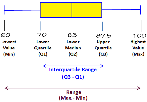
Reading Box and Whisker Plots,
Predict & Display Data Probability – Sample Space

Probability – Counting Principle Probability – Independent Event Probability Application